網頁前端 5
楓資-呆容真
Index
課程預告
課程預告
- 11/13 專案(一)
- 11/20 段考前一週停課
- 11/27 段考週停課
- 12/4 專案(二)
- 12/11 成發準備
- 12/18 成發
- 12/25 行憲紀念日
- 1/1 元旦
運氣非常不好很難過了 我們是最早結束的放課QQ
遊戲介紹
遊戲介紹
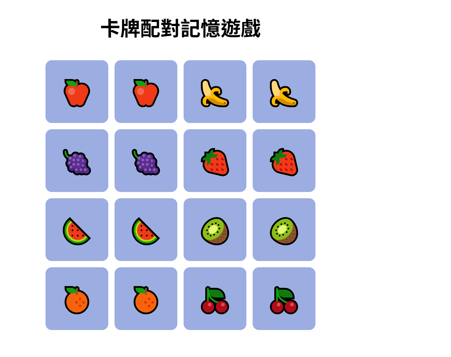
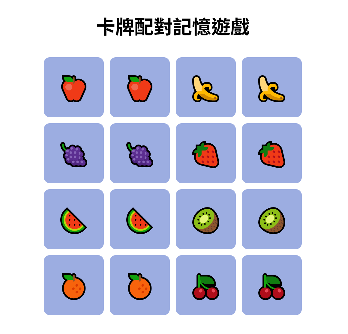
卡牌配對記憶遊戲
- 多對卡牌放置在隨機位置
- 一次只能翻兩張牌
- 若兩張卡牌圖案相同即配對成功否則蓋回去
- 所有卡牌配對成功就遊戲結束
<!DOCTYPE html>
<html lang="zh-Hant">
<head>
  <meta charset="UTF-8" />
  <title>記憶配對卡</title>
  <link rel="stylesheet" href="style.css" />
</head>
<body>
  <h1>記憶小遊戲</h1>
  <div id="game"></div>
  <script src="script.js"></script>
</body>
</html>
const game = document.getElementById("game");
const icons = ["🍎", "🍎", "🍌", "🍌", "🍓", "🍓", "🍇", "🍇", "🍉", "🍉", "🥝", "🥝", "🍊", "🍊", "🍒", "🍒"];
let cards = [];
let flippedCards = [];
let matchedCount = 0;
icons.sort(() => Math.random() - 0.5);
for (let i = 0; i < icons.length; i++) {
const card = document.createElement("div");
card.classList.add("card");
card.dataset.icon = icons[i];
card.addEventListener("click", flipCard);
game.appendChild(card);
cards.push(card);
}
function flipCard(e) {
const card = e.target;
if (card.classList.contains("flipped") || card.classList.contains("matched")) {
return;
}
card.classList.add("flipped");
card.textContent = card.dataset.icon;
flippedCards.push(card);
if (flippedCards.length === 2) {
checkMatch();
}
}
function checkMatch() {
const [card1, card2] = flippedCards;
if (card1.dataset.icon === card2.dataset.icon) {
card1.classList.add("matched");
card2.classList.add("matched");
matchedCount += 2;
flippedCards = [];
if (matchedCount === cards.length) {
setTimeout(() => alert("🎉 恭喜完成!"), 300);
}
} else {
setTimeout(() => {
card1.classList.remove("flipped");
card2.classList.remove("flipped");
card1.textContent = "";
card2.textContent = "";
flippedCards = [];
}, 800);
}
}body {
text-align: center;
font-family: sans-serif;
background-color: white;
}
#game {
display: grid;
grid-template-columns: repeat(4, 100px);
gap: 10px;
justify-content: center;
margin-top: 30px;
}
.card {
width: 100px;
height: 100px;
background-color: #9cade1;
color: white;
font-size: 40px;
display: flex;
justify-content: center;
align-items: center;
cursor: pointer;
border-radius: 10px;
user-select: none;
transition: background-color 0.3s;
}
.flipped {
background-color: #fbf8d7;
color: #333;
cursor: default;
}
.matched {
background-color: #c9e1c9;
color: #333;
}遊戲介紹

HTML
CSS
JavaScript
架構
外觀
行為
HTML
HTML
標題
遊戲區塊
HTML
<!DOCTYPE html>
<html lang="zh-Hant">
<head>
  <meta charset="UTF-8" />
  <title>卡牌配對記憶遊戲</title>
  <link rel="stylesheet" href="style.css" />
</head>
<body>
  <h1>卡牌配對記憶遊戲</h1>
  <div id="game">
    <div class="card">🍎</div>
    <div class="card">🍎</div>
    <div class="card">🍌</div>
    <div class="card">🍌</div>
    <div class="card">🍇</div>
    <div class="card">🍇</div>
    <div class="card">🍓</div>
    <div class="card">🍓</div>
    			.
    			.
    			.
  </div>
  <script src="script.js"></script>
</body>
</html>
HTML
<h1>卡牌配對記憶遊戲</h1><div id="game">
<div class="card">🍎</div>
<div class="card">🍎</div>
<div class="card">🍌</div>
<div class="card">🍌</div>
<div class="card">🍇</div>
<div class="card">🍇</div>
<div class="card">🍓</div>
<div class="card">🍓</div>
<div class="card">🍉</div>
<div class="card">🍉</div>
<div class="card">🥝</div>
<div class="card">🥝</div>
<div class="card">🍊</div>
<div class="card">🍊</div>
<div class="card">🍒</div>
<div class="card">🍒</div>
</div>顯示標題
h1為最大字體
創建卡牌
建立一個 id 為 "game" 的大容器
以方便在 CSS 中調整卡牌的位置
裡面包著所有卡牌
設為相同的 class
位置固定? 每次玩都一樣?
利用 JS 在隨機位置建立卡牌!
為了方便操作 CSS 暫時將位置固定
CSS
CSS
- body 所有內容
- game 遊戲區塊
-
card 卡片外觀
- card 覆蓋時
- flipped 翻過來時
- matched 成功配對時
body {
  text-align: center;
  background-color: white;
}

#game {
  display: grid;
  grid-template-columns: repeat(4, 100px);
  gap: 10px;
  justify-content: center;
}

.card {
  width: 100px;
  height: 100px;
  background-color: #9cade1;
  font-size: 40px;
  display: flex;
  justify-content: center;
  align-items: center;
  cursor: pointer;
  border-radius: 10px;
  user-select: none;
  transition: background-color 0.3s;
}

.flipped {
  background-color: #fbf8d7;
  cursor: default;
}

.matched {
  background-color: #c9e1c9;
}
CSS-body
body {
  text-align: center;
  background-color: white;
}
text-align
文字對齊
| left | 靠左對齊(預設) |
|---|---|
| right | 靠右對齊 |
| center | 置中對齊 |
| justify | 兩端對齊(左右都對齊) |
background-color
背景顏色
CSS-game
#game {
  display: grid;
  grid-template-columns: repeat(4, 100px);
  gap: 10px;
  justify-content: center;
}
display 排版
| 常見值 | 說明 | 例子 |
|---|---|---|
| block | 區塊元素,占一整行,寬度可設定 | <div>、<p>、<h1>~<h6> |
| inline | 行內元素,不會換行,只佔文字大小 | <span>、<a>、<b>、<i> |
| inline-block | 行內元素,但可以設定寬高 | 按鈕、圖示 |
| flex | 彈性容器,用來控制子元素排列 | 排列子元素 |
| grid | 網格容器,用來排列子元素成格子 | 表格 |
CSS-game
#game {
  display: grid;
  grid-template-columns: repeat(4, 100px);
  gap: 10px;
  justify-content: center;
}
grid-template-columns
將卡片分成四欄(4 * 4)
CSS-game
gap
卡牌彼此間的空隙
#game {
  display: grid;
  grid-template-columns: repeat(4, 100px);
  gap: 10px;
  justify-content: center;
}
CSS-game
justify-content
子元素水平對齊
#game {
  display: grid;
  grid-template-columns: repeat(4, 100px);
  gap: 10px;
  justify-content: center;
}| 常見值 | 效果 | 說明 |
|---|---|---|
| flex-start | 靠左(預設) | 子元素從容器開頭開始排 |
| center | 置中 | 子元素平均靠中間 |
| flex-end | 靠右 | 子元素靠容器尾端 |
| space-between | 兩邊貼邊,中間等距 | 常用於按鈕、導覽列 |
| space-around | 每個元素左右留一樣距離 | 有均勻留白 |
| space-evenly | 每個元素間隔完全一樣 | 最平均的排列 |
CSS-card
width
卡牌寬度
.card {
  width: 100px;
  height: 100px;
  background-color: #9cade1;
  font-size: 40px;
  display: flex;
  justify-content: center;
  align-items: center;
  cursor: pointer;
  border-radius: 10px;
  user-select: none;
  transition: background-color 0.3s;
}
height
卡牌高度
background-color
背景顏色
font-size
字體(卡牌圖案)大小
CSS-card
justify-content
子元素水平對齊
.card {
  width: 100px;
  height: 100px;
  background-color: #9cade1;
  font-size: 40px;
  display: flex;
  justify-content: center;
  align-items: center;
  cursor: pointer;
  border-radius: 10px;
  user-select: none;
  transition: background-color 0.3s;
}
align-items
子元素垂直對齊
| 常見值 | 效果 | 說明 |
|---|---|---|
| flex-start | 靠上(預設) | 子元素從容器最上面開始排 |
| center | 置中 | 子元素平均靠中間 |
| flex-end | 靠下 | 子元素靠容器底部 |
| stretch | 撐滿容器高度 | 等高布局 |
align-items
CSS-card
cursor
游標形狀
.card {
  width: 100px;
  height: 100px;
  background-color: #9cade1;
  font-size: 40px;
  display: flex;
  justify-content: center;
  align-items: center;
  cursor: pointer;
  border-radius: 10px;
  user-select: none;
  transition: background-color 0.3s;
}
| 常見值 | 效果 | 說明 |
|---|---|---|
| default | 普通箭頭 | 預設游標 |
| pointer | 手指圖示 | 代表可點擊(常用在按鈕、卡片、連結) |
| text | 張開的手掌 | 可以拖動(未按下) |
| grab | 撐滿容器高度 | 等高布局 |
| grabbing | 抓住的手 | 正在拖動中 |
CSS-card
border-radius
元素邊角的圓弧程度
.card {
  width: 100px;
  height: 100px;
  background-color: #9cade1;
  font-size: 40px;
  display: flex;
  justify-content: center;
  align-items: center;
  cursor: pointer;
  border-radius: 10px;
  user-select: none;
  transition: background-color 0.3s;
}
10px 30px 50px
CSS-card
user-selec
控制使用者是否可以選取文字
.card {
  width: 100px;
  height: 100px;
  background-color: #9cade1;
  font-size: 40px;
  display: flex;
  justify-content: center;
  align-items: center;
  cursor: pointer;
  border-radius: 10px;
  user-select: none;
  transition: background-color 0.3s;
}
| text | 允許選取 |
|---|---|
| none | 禁止選取 |
| all | 點一下就全選 |
CSS-card
transition
背景顏色動畫
.card {
  width: 100px;
  height: 100px;
  background-color: #9cade1;
  font-size: 40px;
  display: flex;
  justify-content: center;
  align-items: center;
  cursor: pointer;
  border-radius: 10px;
  user-select: none;
  transition: background-color 0.3s;
}
翻牌時顏色漸變持續0.3秒
.card {
  transition: background-color 0.3s;
}

.card:hover {
  background-color :#c1c8e0;
}
範例 rice:
CSS-flipped
.flipped {
  background-color: #fbf8d7;
  color: #333;
  cursor: default;
}
CSS-matched
.matched {
  background-color: #c9e1c9;
  color: #333;
}
CSS
thanks !
網頁前端5
By ariel tai


